Understand design best practicesUpdated 6 months ago
Avoid colors that are low contrast
Though the colors may appear different from each other on the screen, it may not be the case with the actual sweater. If possible, avoid using low-contrast colors together if you want to make sure the final result will be clearly visible.
Take the examples of Artwork Version vs. Actual Sweater below and notice how the RGB colors change when knitted:A perfect example of poor color combination:
Bleach, Taupe, and Bone.The bunny’s color which is Bleach mostly got consumed by the background color Powder; making it almost invisible against the background. This is another example of the result of the slight difference between the RGB and thread color.
When knitted, Burgundy and Soil seem to merge together to reflect one color. Digitally, there is already poor contrast between the two colors. This is due to poor color choice.
- Use the Pen tool or Knitwise pixel brush
To achieve better results on your designs, use the Pen tool or Knitwise pixel brush to create hard edges without smoothness. Also, keep the color 100% opacity. Otherwise, it generates smooth edges and causes an anti-aliasing effect which create “new" colors.
The image below illustrates an anti-aliasing effect. An image might look like it’s using only 4 colors when viewed casually, but if we zoom in we can see that additional colors are used to smooth out the edges.
Follow these steps to install the Knitwise pixel brush:
- Download Knitwise Pixel Brushes.abr
- In Photoshop, (make sure you have at least one document open) open the Brush Preset from the Window menu.
- Click on the "List icon", select "Load Brushes" and go to the folder where you downloaded the file.
- Double-click on the file to import it
See the tutorial video:
- Avoid basing your designs on images with lots of very different and distinct colors.
Keep in mind that our product only supports up to 4 colors in the design. While working with our template, it's best to avoid using images with many very different colors. If you're using an existing image, you might need to adjust it using Color Indexing. This process simplifies the colors in the image to match our design requirements.
Here are two examples comparing the original colors with the indexed colors of the same image.
- Mix swatches for additional colors
By using dithering techniques, we can generate new colors that are not included in the available Swatches. Dithering uses adjacent pixels to give the appearance of a third color and to create a gradient effect.Example of using dithering to achieve color transition between 2 separate swatches:
More examples:
Avoid stray pixels
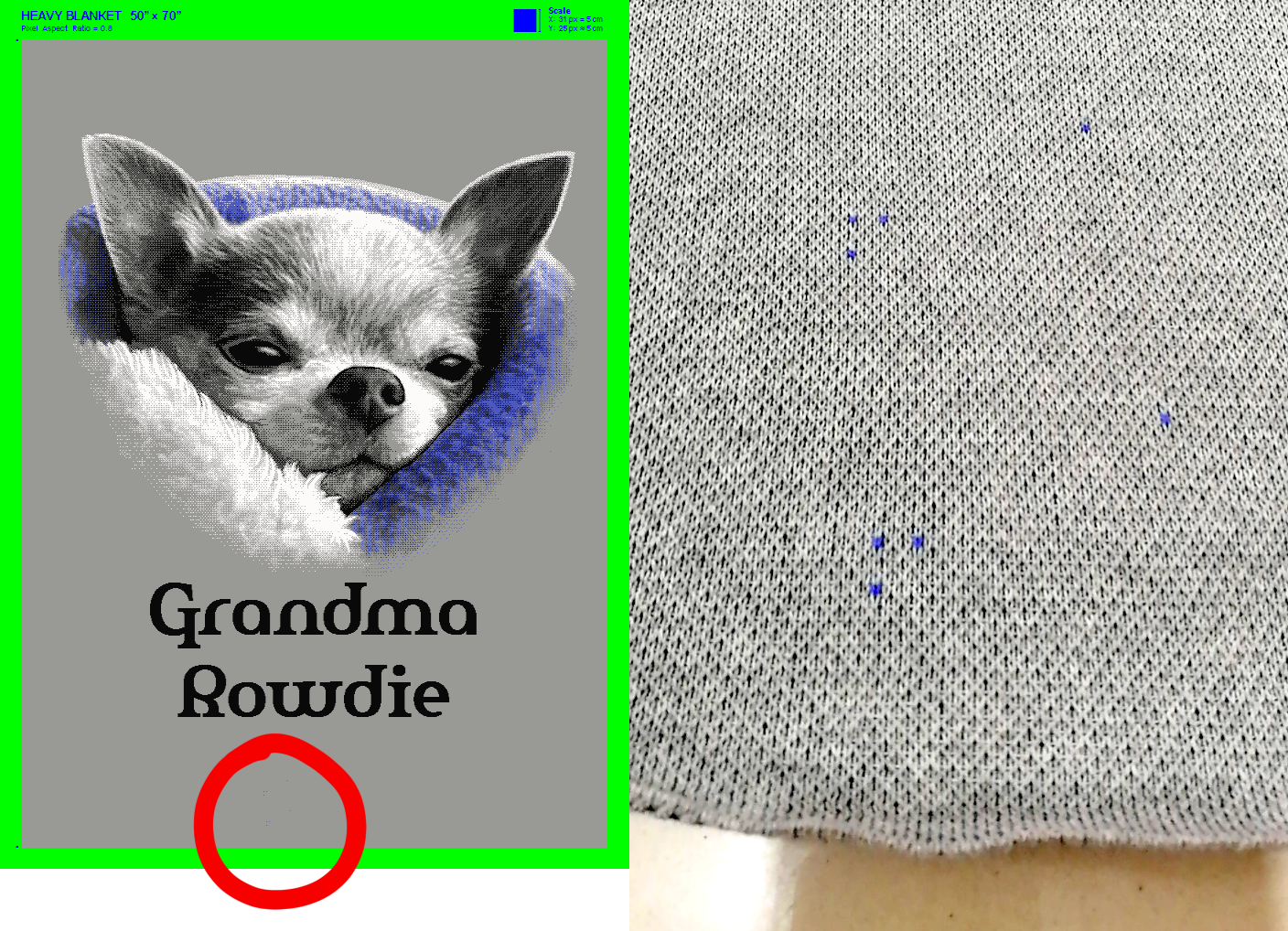
Sometimes, a lone pixel is left somewhere on the canvas by mistake. This will be translated into yarn and knit the same as any other pixel! It will look like a stain, so check your artwork for such mistakes before uploading the artwork and sending it to the factory.
It can be a bit hard to see depending on the size of your screen; if so, please open the image and inspect it at full size by either double-clicking on it or downloading it and opening it in an image editor.
See some examples: